Crash Flop
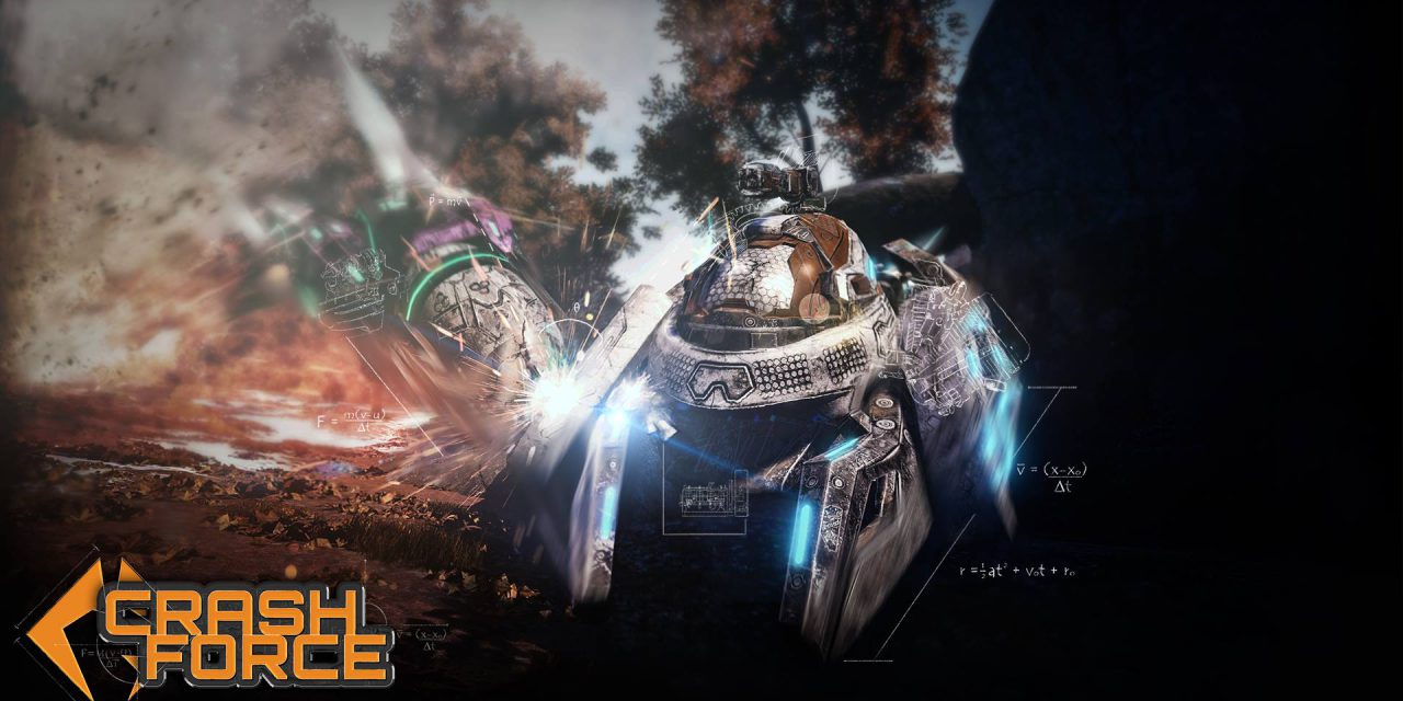
On steam Crash Force is described as “An amalgamation of the most popular genres in gaming; it is a multiplayer, arena, shooting game at its core with RPG and racing elements where the player assumes the role of a hovercraft to annihilate their enemies.”
Crash Force sounds fun, it is a hovercraft arena shooter with progression, But right now it’s not £22.99 worth of fun. It’s an early access game sure, but I would not expect an early access bike to have no wheels.
I shall start from the top, The game at start up seems to have a odd identity crisis with the opening been a rather nice looking animation of calculations been drawn onto parchment only then for the main menu to be displayed in front of a garage from science fiction, No parchment in sight I half expected a steampunk style although Steampunk hovercrafts sound pretty cool someone should do something about that.
But instead we have a range of dirty looking si-fi hovercraft with four abilities each. These abilities do come with descriptions along with been interesting and varied but the two weapons your hovercraft has do not have any written information just two icons, and while they are easy to decipher (3 bullets is a machine gun, Line that splits at the end a Laser) they don’t have names or any information until your in game and then they only have names although hitting a foe does result in damage numbers been displayed.
In combat you can also right click to zoom in, with the setting and pace of the game this function seems obsolete and I believe would be better suited to firing your secondary weapon instead of the need to stop firing scroll up on the mouse wheel to change weapon then trying to resume firing only to find your still changing weapon and then clicking again to finally now fire your secondary.
In one of my three games my opponent was able to stun me entirely, only after the third time did I see the little pop up in the top left of the screen telling me I was stunned or well rather that I wasn’t allowed to play for what felt like at least 8 seconds. (This information would be much better suited roughly 4/5th up the screen centre) the rest of the UI it uninformative with a diamond set up for my skills so it was luck if I triggered the correct one with 1-4.
In PvP games everyone needs tools, weapons and the like that are fun to use but also fun to play against, I know when I see a foe glowing, emitting waves or flashing I need to move away or at least get behind cover this peril believe it or not does entertain both parties, in an arena brawler I much rather see a weapon lock or add a few seconds of ability cool down instead of a stun this way my gameplay doesn’t lose pace and my opponents has a chance to be more aggressive while I can try to react by getting out of way to recover, Also this time can be used for more than just running away, in a game of this style where pickups are available I can go grab ammo or energy ect.
Back to the hovercraft selection and actually getting into a game, I know games need to have a level of accessibility but when selecting a character, vehicle or weapon showing me different length bars with miscellaneous titles is insulting I can deal with the numbers and real titles of said numbers let me have them.

This is why I dislike stat bars and stylized labelling. Looking at the tanking stat I would expect the RAPAX to have a minimum of 2.4 times the HP of the MYOTIS. Or over four times looking at the skirmishing stat if either or both are even meant to relate to HP.
After selecting a hovercraft you are then peppered with numbers (The screen I got the above HP values from) so picking a hovercraft is now based off jumping between three pages to actually see the stats of each hovercraft this process of clicking play selecting a hovercraft, Picking the images that spin under my hovercraft, looking at my stats then picking a map and a game mode, this is why if I did go outside I wouldn’t go to coffee or sandwich shops, just give me my coffee or my sandwich, lets me battle hovercrafts without so many questions.
The menu does have a profile button and this hides the progression but more on that balancing nightmare later, I really think the image that spins under my hovercraft selection should live in profile I mean selecting an image every single time I queue for a game is unnecessary and if all I want to do is fight I don’t care what map I’m on or the game mode, a lot of PvP games have a quick play button for a reason, people like myself that dislike sandwich and coffee shops.
The progression in the game also worries me from a balance prospective, upon finding the skill tree tucked away in the profile section, there are 3 pages Attack, Defence and Utility the “Skills” are mostly percentage increases to damage, HP, regen with a few being more interesting like exploding on death and having full control of your hovercraft while in the air. But while I’m a fan of progression, In a PvP arena game it seems misplaced as most people dislike having major disadvantages in what you would want to be a battle of skill and wits. I have not had a chance to see it but I would hope that when matchmaking finds a group of player they are assigned teams in a way that balanced their total levels as each level could mean anything from 9.4% more health to returning to 40% from 0 health once a life.
Overall I am hoping that soon an update will make this preview outdated but as it is now the idea is great but its lacking the excitement I would expect from an arena shooter, I do not recommend purchasing Crash Force as it is now, but just in case the game can be found here.
The word hovercraft only appears seventeen times in this article.
Crash Force is now available via Steam
A Steam Early Access Code was provided by Ascanio Entertainment

