The true sequel after 23 years of waiting, and totally worth it
It’s no secret that Sonics transition into the 3D world wasn’t the rousing success that his rival Mario had. While Mario enjoyed a plethora of games in the 3D world with a constant high rating, Sonics games have always been mediocre at best, and then recently Sonic Boom and the Rise of Lyric drove the entire franchise into the ground that even Sonics most loyal fans couldn’t defend. I’ve always been a Sonic fan, but even I know that the series has not fared well in the 3D world, with some exceptions like Colours and Generations, its been pretty bad. Even his earlier titles like Sonic Adventure 1 and 2 have aged poorly and as a whole, are pretty bad games. Luckily it seems SEGA are onto this, and while we have Sonic Forces coming (made by the same team that made Colours and Generations), they decided to give us an absolute treat of a game that hit me, and no doubt hundreds of other gamers, right in the Nostalgia spot. A true sequel to Sonic 3 & Knuckles (and not that Sonic 4 garbage) made by people who truly understood Sonic games. Sonic Mania was one of the most anticipated games of the year for me.
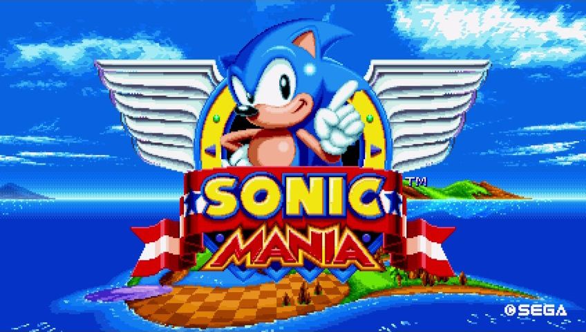
As soon as the game starts you’re greeted with that old familiar “SEGA” chime and I already had a huge smile on my face. The title of Sonic Mania loads in classic fashion, with Sonic center screen waving his finger as he had done in the Mega Drive days of before. Leaving the game for a few seconds loads up an animated intro for the game, which is one of the most endearing starts I’ve ever seen for any game. Sonic, Tails and Knuckles blasting through stages in a beautifully animated intro reminiscent of classic Sonic in the 90s. Without even playing the game we can see the effort gone into making this game a true love letter to the fans. One of the major developers for the game, Christian Whitehead, started out by modding games such as Sonic CD to make them more playable. The intro animation was created by Tyson Hesse, who started out drawing Sonic fan art on DeviantArt using a pen pressure sensitivity tablet, who was then picked up by Archie Comics to do work for Sonic the Comic. SEGA picking up these types of people, people who understand what makes the games so great, just shows how committed they were to making an authentic experience for the fans.
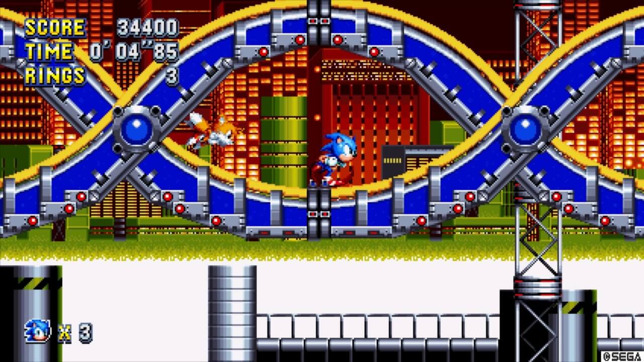
Chemical Planet Zone still has the best music
But enough about all that, how is the game? In short, it’s everything you’d expect from classic sonic, but so much more. Think if Sega released another 2D sonic, but on the Saturn, so you’ve got the basic Sonic gameplay, but with added effects, music, textures and basic 3d graphics. The amount of work gone into making it feel like a sequel to a 23 year old game truly shows. Sonic handles exactly as you expect him to, you can feel the weight of the character, the bounce off after attacking badniks, the flow of jumping of ledges and rolling into a ball and flying down ramps and loops, it’s perfect. You get all the standard tricks including some from Sonic CD, the lesser played one, such as the drop dash (although I haven’t really used it). Some of the elements are tweaked however. Chaos Emerald stages are a brand new type of game, with a very 90s aesthetic going on, which have the art style of the special stages from Sonic 1, but play like the special stages from Sonic CD. Checkpoint special stages are taken straight from the tense ‘collect the blue spheres’ game from Sonic 3 / Sonic & Knuckles. But as a whole – it’s the same game you’ve been used to. It’s the same running and jumping on badniks, collecting rings, trying not to drown, defeat the mini boss and move onto act 2.
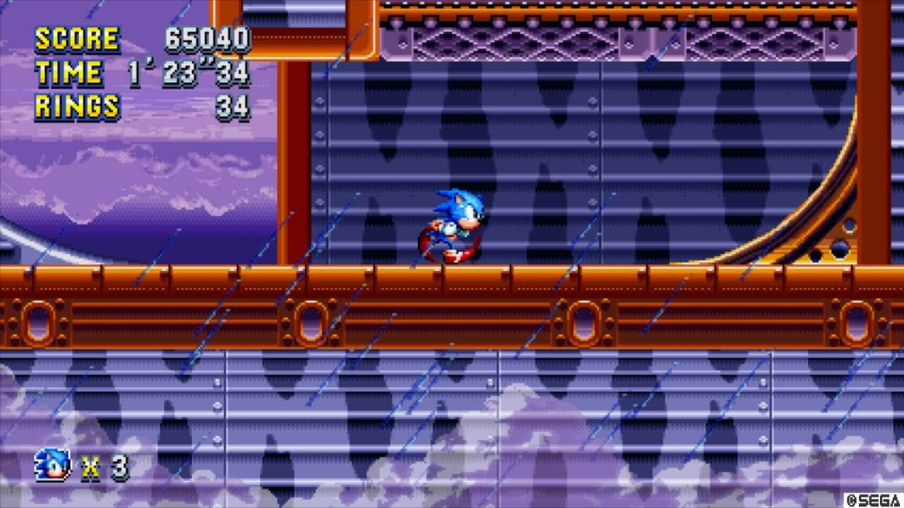
Speaking of levels, most of them fit right in with the other classic sonics levels, this is sadly because a good portion of the levels are ripped straight from classic Sonic games. I say sadly because while I still enjoy these levels, and it was so much fun to be playing them again, I want new levels, as most of the new levels have their own theme and aesthetic going on and I really wanted to see what new types of worlds we could explore with Sonic. The art into these new levels though is a perfect fit for what we had in the 90’s, and with the ‘Saturn style’ graphics we’re getting, and this is clear on the sprites too. The animation of them has more frames compared to before, even the spinning rings seems smoother and Sonics new run animation at his fastest is such a throwback it shows they knew exactly what they wanted to do when making this game. Not only this, but they’ve added so many new mechanics to the levels. Act 1 tends to be more a standard straight forward level, and for the classic remakes, it’s more of a remix of what they were. Act 2 however totally mixes up and throws new stuff at you. Take Chemical Plant for instance, act 1 is pretty much how I remembered it, act 2 though was a totally new world.
They’ve added some bouncy goo, some sticky pads you can ride walls with, some DNA helix lift thing and is nothing like the act 2 from Sonic 2 back in the day. The Music itself is something of pure joy, most of the classic levels have gotten 32bit remixes, and the new stages are exactly what you’d expect from classic Sonic, and sometimes incorporating vocal samples an extra effects that the ‘new’ hardware could process. Press Gardens theme is a personal favorite, totally chaotic but happy and catchy. But what really proved to me that this game was made by fans who knew what they were doing is the minor details. I noticed that when doing the spin dash, if you mashed the button the sounds who overlay creating a high pitched spinning noise which just sounds slightly broken, but the original did, so this game must also do that. My favourite however is the screen catch up. In normal gameplay Sonic is center screen all the time, but when you get send on several different boosts or springs, he can tend to fly towards the edge of the screen and it tries to catchup with you.
From what I understand originally this was due to the Mega Drive processor trying to process everything going on at once and couldn’t keep up with Sonic, therefore had to keep the screen going a constant speed so it wouldn’t crash. Obviously this is on a console that is several hundred times more powerful than a Mega Drive – but they kept it in to be authentic, to stay true to what Sonic on the Mega Drive was.
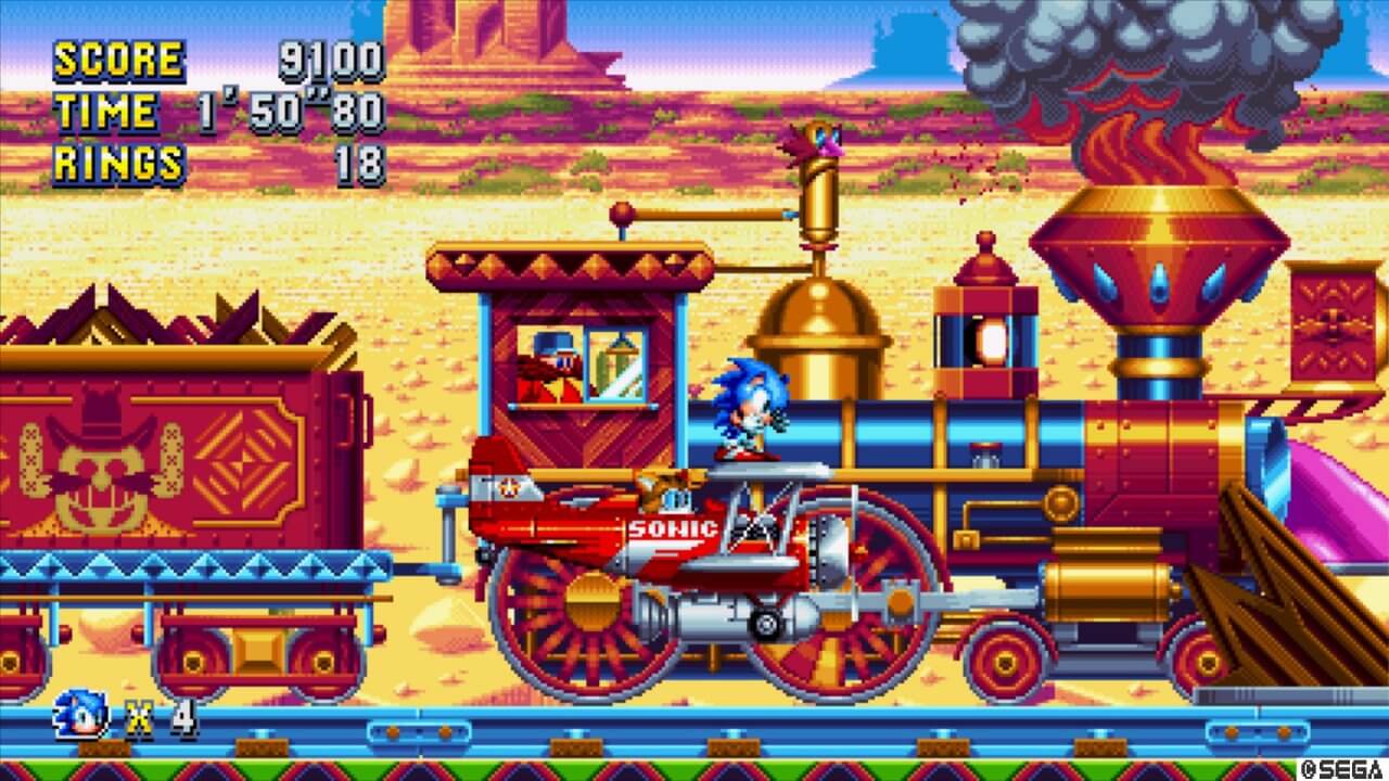
The colour pallet used in the game is exactly what I’d expect from a Mega Drive
I said I was a classic Sonic fan and I would try not to be bias, but this game is love letter to the fans and Sega deserve some major kudos for bringing it to them. Aside from a bit too many remakes of classic levels and not enough new ones, this game has the mechanics and feel of a sonic game nailed perfect, the art and look of the game is straight from the 90s and the music is no doubt something I’ll be listening to for some time.
But this game does worry me for a very solid reason however.
As said, Sonic has been suffering for many years now and this release is being praised as a return to form for the Sonic series. But does that mean in order for Sonic to be good, it has to look like it was made on classic Sega consoles? I wouldn’t against another classic Sonic game and I suspect due to the reception on Mania, Sega will be looking into it. but I still want a good 3D sonic game. I have faith that it cane be done. Sega are on the right track with how Mania was handled with who it hired and the aesthetic they were going for but only time will tell.
For now we still have Sonic Mania, a gem of a game that is the true sequel to Sonic & Knuckles all those years ago and a must play not just for any Sonic fan, but anyone who grew up in the classic era of Sega and Nintendo, this is a game that will make you fall in love with our gaming icons all over again.

